Importance of Minimal Packaging Design in Branding
If you are one who believes in “less is more,” then there are chances you would love minimal packaging design. Almost 92% of people prefer minimal packaging over other forms. When it comes to this type of packaging, brands choose simplicity and sustainability to showcase their identity. Especially in the premium category of products, a minimal approach works the best and attracts more customers. Simple and elegant things are easily recognisable and have the potential to deliver brand messages effectively.
What is Minimalistic Packaging Design ?
It involves graphics that incorporate simplicity and clarity and avoids unnecessary decoration and colours. This design philosophy follows things like clear layouts and believes in showing key information concisely that can communicate with the customers efficiently and offer a positive experience. High-end brands generally follow a smooth finish with a minimalistic design approach, with sleek and modern images if required.
Benefits of Minimalistic Packaging Design
Some benefits of minimal packaging design are:
Eye Catchy
Minimal design packaging uses fewer lines and graphics that make it more noticeable and recognisable among other similar products. A clean, simple minimal design, stands out on crowded shelves of supermarkets.
Luxury feel
Minimal design packaging derives a sense of premium-ness and luxury that further helps attract customers. In the competitive market, minimal packaging helps you grab a particular section of customers. A timeless quality is attached to the product that makes it classy and never goes out of fashion.
Aesthetic appeal
Minimal design packaging not only adds a luxurious touch but simultaneously enhances the aesthetic appeal that attracts consumers to buy the products. People like to buy things that offers a feeling of sumptuousness.
Offers Better Understanding
A simple minimal packaging enhances the readability of important contents such as ingredients, features, and warnings (if any). This makes it difficult to miss important instructions by the consumer. All this makes the product way better to understand than the other products with some extravagant packaging.
Reduced Environmental Impact
Minimal Packaging uses less amount of resources, which further helps in reducing the brand’s carbon footprint. Minimal packaging design involves less ink for printing, optimal utilisation of white space, and less material for packaging than extravagant packaging. All this adds up and contributes sustainably.
Better Brand Recognition
One of the best things about minimal packaging is that it enhances the elements written on it. So, it helps in creating aunique brand identityand promoting brand recognition, and over time people start relating a particular packaging with the brand. This way, a loyal customer base is created.
Offers Versatility
Minimalist packaging is quite versatile and more adaptable to different genres of product categories. It maintains Brand aesthetics and simultaneously accommodates many product types. All this allows the Brand to diversify its offerings while maintaining its style.
Examples of Minimal Packaging Design
If we go back 20 years and do an observation regarding packaging, we would find that minimal packaging design were majorly opted for by the luxury brands as they cracked years back that minimal designing has various benefits and simultaneously offers a feel of luxury. For instance, fashion brands like Burberry, Dior, Channel, Prada, Ralph Lauren, and more choose minimal design packaging during the times when extravagant packaging was in trend.
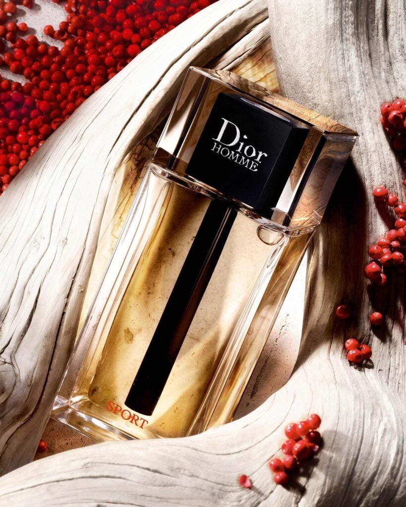
credit: Dior Instagram
In the above picture, the luxury fashion brand Dior’s packaging is a perfect example of how minimal design can make people stare at the premium-ness it offers. If we observe carefully, we would observe only two colour tones are used that complement each other and the bottle only has the Brand logo and a few other words.
Over the years, marketers have understood that customers relate minimalism with luxury. So, to offer them the feeling of sumptuousness, they started inculcating minimal design in product packaging.The best example of this is the present cosmetic brands. Most of the skincare brands have focused a lot on their packaging and if analysed carefully, minimalism is what they have followed. Some Indian-grown skincare brands like Plum, Mystic Earth, d’you, and more choose minimal design over extravagant design.
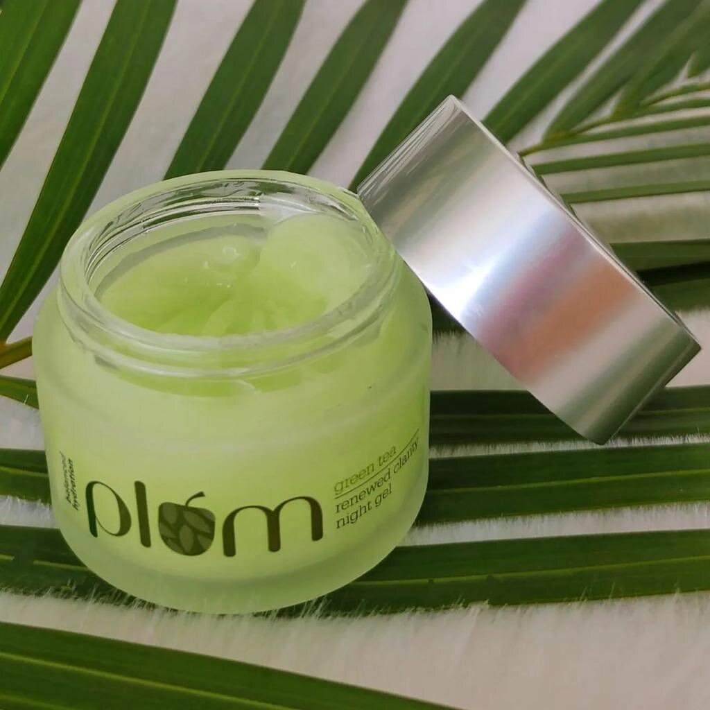
Pic credit: Plum Instagram
In the above picture, it is quite clear that Plum has used its logo and a few other necessary information over the packaging. Minimalism helped people recognize Plum through their logo, whenever next time they came across the product. Hence, minimal packaging design does have various benefits that brands take advantage of to attract customers.
Conclusion
Hopefully, you will find the information interesting and useful. If you are an entrepreneur who is thinking of starting a cosmetic brand and looking for the best cosmetic tube manufacturers, considerSitons Propack. You can get it customised in various shapes, and sizes and further choose any design to get printed on it.

