A Comprehensive Guide to Colour Packaging Psychology
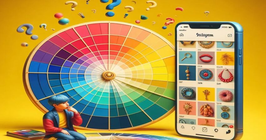
Someone involved in thedesigning or brandingknows about colour packaging psychology. They understand that every colour carries itself an emotion and is very likely to evoke a similar emotion in the observer. They use various techniques like colour wheel to design thepackaging of the product. Furthermore, they make sure that the colour and the complementary colour should match the vibe of the product.
Colour packaging psychology knows how different hues of colours affect consumer behaviour. And selecting the right colour can increase the sales of the product. So, brands should consider the following points while choosing the colours for packaging:
- The types of emotions evoked by the colours used in the packaging.
- Check out the popular brands of similar industries and the colour they are using in their packaging and branding.
Let’s have a look at some of the facts associated with the colour psychology in packaging
Color Psychology in Packaging: Key Insights
Red
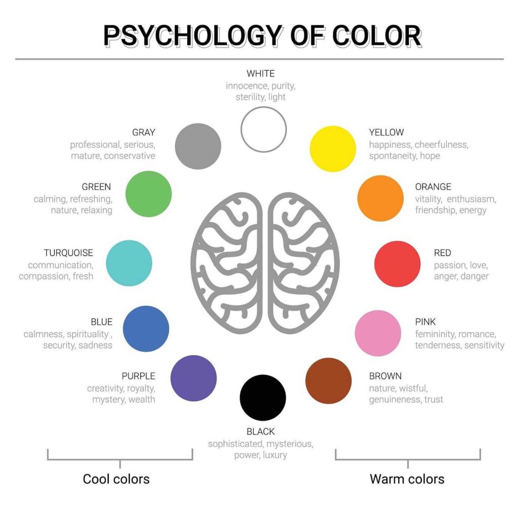
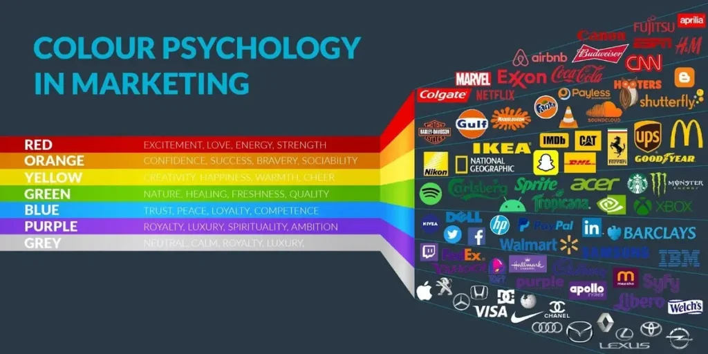
Red is the colour of excitement, passion, love, and strength. This colour packaging psychology invokes strong emotions among customers. Bright red conveys the idea of lively and energetic and powerful products. Whereas darker red symbolizes premium and professionalism. Various lifestyle and entertainment brands use red colour to portray energy and excitement. Popular Brands like Coca-Cola, KFC, Netflix, and Nescafé, use red colour.
Industries: Food and beverage industries, retail, lifestyle, entertainment
Orange
Orange is often misunderstood that it conveys lower-cost and budget-friendly items but that is not true. It is a friendly and cheerful colour. It is a potent colour to instigate emotions like friendliness, fun, and adventure.
Orange is generally used in combination with other colours. Popular brands like Fanta, Nickelodeon, and Firefox use orange colour for their marketing.
Industries: Food and beverage, DIY, cartoon Industries.
Yellow
Yellow is the colour that reflects energy, happiness, fun, and confidence. It is mostly combined with different colours to convey different sets of messages to the customers. Purely yellow packaging is mainly used for products focusing on children. Packaging colour psychology considers yellow to portray originality and innovativeness. Popular brands like McDonald’s, Shell, Subway, and National Geographic use yellow colour.
Industries: Fast food, Natural industries, Toy industries.
Green
Green is the colour of freshness, nature, and wealth. It is a potent colour that has the power to instigate various emotions and feelings. Brands who wants to convey a thought ofeco-friendlinessalso use green colour packaging psychology. Brighter shades of green are more energising and fresh whereas darker shades of green are more relaxing and provide a feeling of calmness. Popular brands like Subway, Starbucks, and Landover use green colour.
Industries: Medical, health and wellbeing, foods
Blue
Blue is the colour of trust and logic. Considered to be a safe color, blue is easily acceptable and liked by both genders. Different hues of blue can be chosen according to the age group. Darker shades of blue go well if the targeting customers belong to older generations. Whereas, the brighter and more vibrant shades of blues attract the younger generation. Popular brands like HP, Dell, Facebook, Oral B, Gillete uses blue colour packaging psychology to develop a sense a trust and dependability among its customers.
Industries: Electronics, software, pharmaceuticals, and medicines
Purple
Purple is the colour of indulgence, wisdom, luxury, and spirituality. Its best thing is that it appeals to every age group, particularly the female and young generation. Purple is a colour of opulence, so it is easier to target high-end customers. This colour is often associated with spirituality and the well-being of people, so products like incense sticks and yoga accessories packaging often use this colour . Popular brands like Cadbury’s, yahoo, and Hallmark use purple packaging.
Industries: Food and drink, luxury products, spiritual products.
Turquoise
Turquoise colour conveys calmness, purity, and clarity. This colour is quite used in cleaning product packaging as it symbolizes purity. You can also use turquoise colour packaging for heath-related products or jewellery brands. Popular jewellery brands like Tiffany, and Ornaz use turquoise colour in their packaging. This beautiful colour is eye-catchy and instantly grabs the customer’s attention.
Industries: Jewellery brands, health, cleaning products.
Pink
Pink is the colour that reflects the feminine, beauty, love, and youth. Whereas the softer shades of pink reflect tenderness, and softness, whereas the brighter shades are more of a symbol of power and strength. According to color psychology in packaging, brands mainly choose bright pink to target younger generations, while light shades tend to lean towards the expensive side. Popular brands like Barbie, and Victoria’s Secret use pink colour packaging.
Industries: Cosmetics, and Fashion
Brown
Brown is an earthy colour that reflects its comforting and secure nature. Brands that want to portray themselves as nature-friendly in front of their consumers use brown colour. Brown is also used to reflect the sustainable nature of the brands. M&Ms is a popular brand that uses brown colour packaging.
Industries: Sustainable brands
Black
Black is the colour of power, class, mystery, and sophistication. Brands especially for their premium or exclusive range of products use black colour packaging as it conveys a neutral message along with a touch of authority and elegance. Popular brands likeNike, Adidas, and Audi use black colour packaging to showcase their class and authority in the market.
Industries: Consumer goods, Automotive, Sportswear
White
White is the colour of premium brands. Even customers associate white with high-end products. It is the colour that symbolizes elegance, goodness, purity, and simplicity. Sometimes, white color is associated with new beginnings and innocence, making it a perfect choice for cosmetic brands and pharmaceutical brands. Some popular brands like Apple, Tesla, and Calvin Klein use white colour packaging psychology.
Industries: Luxury goods, High-end consumer electronics, Pharmaceutical products, and cosmetics.
Grey
The Grey colour symbolizes calmness, neutrality, and balance. Majorly high-end brands use this colour as it reflects royalty and class. One of the best things about grey colour is that it goes well with all the sectors. Popular high-end brand Dyson uses grey colour in their packaging.
Industries: High-end electronics, Luxury goods.
Conclusion
Colour packaging psychology plays a crucial role in marketing as it affects the sales of the brand. The brand should design the packaging by considering the age group, gender, and class of people it wants to target
If you are a brand and looking for a cosmetic and pharma tube manufacturing company, then considerSitons Propack pvt. Ltd. We are among the leading tube manufacturers in India. We understand the importance of packaging and that’s why it offers various designs of packaging tubes with customisable printing as per the brand’s demand.

